Sender name, subject line and preview text in Mailchimp: stop wasting your inbox space
Published 10 November 2026
You can spend hours getting an email just right. Tweak the wording, find the perfect images, move the button, move it back again.
But before someone on your mailing list sees any of that, they have to decide whether to open it in the first place. And in the inbox, you’ve only got a tiny amount of space to persuade them.
Your sender name, subject line and preview text all help someone make that decision. On a mobile, where the screen is much narrower, those few words that do show need to work even harder.
I constantly see opportunities being wasted here, both when I’m auditing Mailchimp accounts and in my own inbox:
- Unrecognisable sender names
- Company names or words repeated unnecessarily taking up really valuable space
- The most interesting information cropped off the subject line.
- No useful preview text.
Often, a few small changes would make the message much clearer and immediately increase opens.
Let’s look at some examples.
Three parts of your email that need to work together
When your email appears in someone’s inbox, they’ll typically see:
- Sender name: who it’s from.
- Subject line: what it’s about, or a reason to open it.
- Preview text: a little extra information to support the subject line.
Think of these as a team. Each has a job, and the space is too valuable for them all to say the same thing.
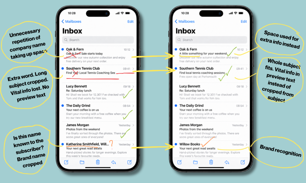
Have another closer look at this image again:
Small changes to the sender name, subject line and preview text make better use of the available space. These examples illustrate the difference; the amount displayed will vary between phones, email apps and settings.
1. Use a sender name your subscribers will recognise
Look at the Willow Books email towards the bottom of the image.
On the left, the sender name starts with Katherine Smithfield, followed by the business name. But it’s too long to display in full, so Willow Books gets cropped.
That’s fine if subscribers know Katherine personally. But if they signed up to hear from Willow Books and have no idea who Katherine is, you’ve made recognition harder than it needs to be.
They’re now looking at an unfamiliar name and deciding whether the email is worth opening. Maybe they’re even wondering if it’s spam or a cold email they never signed up for?
On the right, Willow Books is immediately visible. No thought needed.
Should you use your name or your business name?
It depends on the relationship your subscribers have with you.
If people know you personally, your name can make perfect sense. If they recognise your business, use that. A combination such as Claire at Chimpology can work when both are useful and the name stays reasonably short.
The question to ask is:
What name will the person receiving this email recognise?
Choose it from their perspective. The fact that you know who Katherine is doesn’t mean your subscribers do.
And keep it reasonably consistent. Changing your sender name for every campaign means people have to work out who you are all over again.
2. Don’t spend your subject line repeating the sender name
In the first Oak & Fern example, the business name appears as the sender, then immediately appears again in the subject line:
Sender: Oak & Fern
Subject: Oak & Fern Sale starts today
We already know it’s from Oak & Fern. Those repeated words are taking up space that could tell us something useful about the sale.
You could simply use:
Sale starts today
Or, if it accurately describes the offer:
Autumn sale: up to 30% off
In the image, the alternative is:
A little something for your weekend
That takes a more conversational approach, with the preview text providing the detail. It could suit the brand and its subscribers, but it isn’t automatically stronger than a clear sale announcement. The important improvement is that the subject line now adds something rather than repeating the sender name.
There will be occasions when including your business name is useful. But don’t add it out of habit.
Ask yourself: have I used this space to give someone another reason to open?
3. Put the important information before the cut-off
Now look at Southern Tennis Club.
On the left, the subject line reads: Find Your Local Tennis Coaching Ses
The last word has been cropped. You can probably work out what it means, but the wording is longer than it needs to be. In fact, in the original version, the preview text was also part of the subject line, and that bit can’t even be guessed at.
On the right, a small edit makes it more concise: Find local tennis coaching sessions
Removing “your” and tightening the wording helps the whole subject fit in this example.
This isn’t about making every subject line as short as possible. It’s about making sure the words that survive the cut-off still do a useful job.
Compare:
We’re excited that to announce that bookings are now open for our Christmas workshops
With:
Christmas workshops: bookings now open
In the first version, the opening words tell us how the sender feels. In the second, they tell us what’s available.
You can be warm and personable inside the email. You don’t have to spend your limited inbox space clearing your throat.
How long should a subject line be?
There isn’t one character count that guarantees your full subject line will display everywhere. The available space depends on the device, email app, display settings and the width of the characters themselves. A string of narrow letters takes up less room than the same number of wide ones.
My calculator is a good space to start, and always err on the side of caution by assuming you have less space rather than more. The main thing is to make sure the main point comes across in the few 3 or so words.
4. Give your preview text a proper job
The first Southern Tennis Club example has no useful preview text beneath the subject line. That’s a completely wasted opportunity.
On the right, we’ve added Free open day at Portsmouth.
Now the two lines work together:
Subject: Find local tennis coaching sessions
Preview text: Free open day at Portsmouth
The subject introduces the opportunity. The preview text adds a specific reason to investigate.
“Free”, “open day” and the location could all help someone decide whether this email is relevant to them. They deserve to be visible, rather than squeezed onto the end of an already lengthy subject line which will almost certainly not be seen.
What should you put in preview text?
Use it to add something that helps the reader decide. That might be a price, a deadline, a location or a benefit.
For example:
Subject: Your next great read awaits
Preview text: Hand-picked stories for longer evenings.
Or:
Subject: Last chance to book your workshop
Preview text: Booking closes at midday on Friday.
Avoid simply repeating your subject line. If someone has already read it, telling them the same thing again doesn’t help anyone.
And put the useful words first here too because preview text can also be cropped.
If you leave your preview text empty, an email app may pull in text from the email itself. Sometimes that gives you a useful opening sentence but if the top of your email says “View this email in browser” and “Unsubscribe”, that’s what will show – what a waste of valuable space.
In short, ccheck what’s actually appearing, rather than assuming it will sort itself out.
5. Curiosity is useful. Confusion isn’t.
You don’t have to spell out every detail in your subject line.
Your next coffee is on us, from The Daily Grind in the image, gives someone a clear reason to be interested. The preview text then explains the offer.
But there’s a difference between creating interest and withholding so much information that the reader has no idea why they should care.
Something exciting is coming… Exciting for who? About what?
A subject line can feel intriguing when you’ve spent the morning working on the campaign. To someone scanning their inbox between meetings, it might feel vague or just plain and simple clickbait. After all, we’ve all had way too many emails with “exciting news” which is anything but exciting.
Give the person enough information to recognise that the email is worth their time. Then make sure the message inside delivers on whatever you’ve promised.
Try your subject line in the mobile calculator
Before you send, put your subject line into my mobile subject line calculator.
Use it to spot wording that might disappear on a narrower screen, then have a play around and try moving the important information forward or get rid of words that aren’t super-useful.
Treat the result as an indication, rather than a promise of exactly what every subscriber will see. Different inboxes display different amounts.
And remember to assess the whole combination. A short subject line won’t rescue an unrecognisable sender name or wasted preview text.
Check the inbox, not just the email
When testing, it’s easy to open your email immediately and start checking the design. But pause before you do.
Start by looking at it sitting in your phone’s inbox, alongside everything else competing for your attention.
Put yourself in their shoes. Can you recognise the sender? Can you understand the subject from the words that are visible? Does the preview text add a useful reason to open?
Most importantly, would it make sense to someone who hasn’t spent the last two hours creating it?
Your subscribers don’t get to see the intention behind your wording. They just get the words that fit on their screen.
Make those words count.
Want an experienced pair of eyes on your emails? Book a Mailchimp Power Hour and we take a look at what your subscribers are seeing, opportunities you might be missing, and work through practical improvements together.